
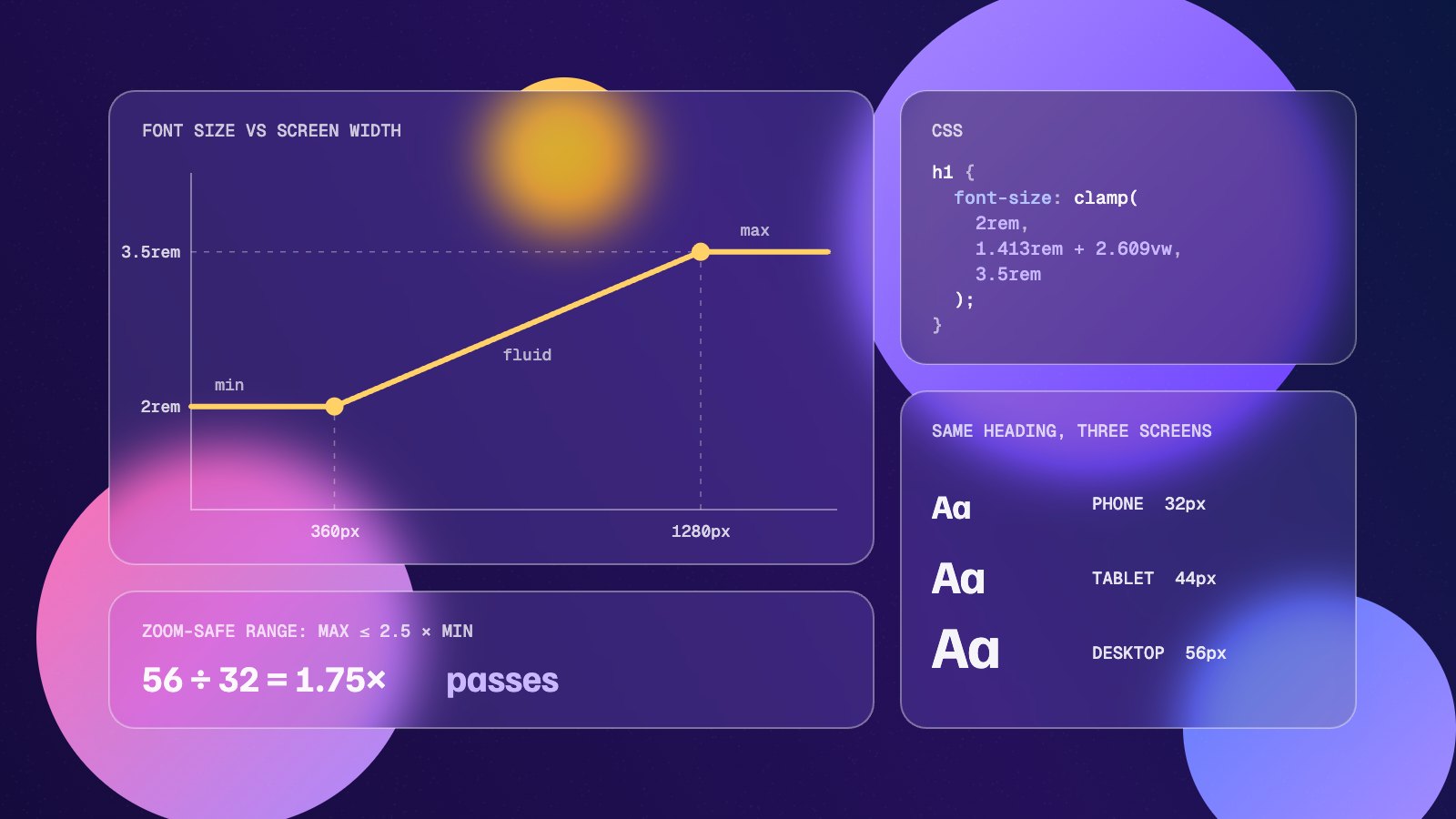
Fluid typography makes text scale smoothly with the screen instead of jumping between fixed sizes at breakpoints. In modern CSS it takes one function, clamp(), and a little arithmetic that most people would rather not do by hand.
This guide explains how clamp() works, shows the maths behind the middle value with a worked example, and covers the accessibility rule that keeps fluid text usable when people zoom.
Key takeaways
clamp(min, preferred, max)uses the preferred value but never goes below the minimum or above the maximum.- For fluid type, the preferred value is a rem amount plus a vw amount, worked out from the two screen widths where scaling starts and stops.
- Never size text in vw alone. Including rem keeps text responsive to browser font settings and zoom.
- Keep the maximum size at or below 2.5 times the minimum so text can still reach 200% when zoomed.
- Fluid type helps most on headings. Body text usually needs a small range or none at all.
What fluid typography solves
The traditional approach sets a heading to one size on phones, then bumps it up at a couple of media query breakpoints. Between those breakpoints the size is fixed, so a 48px heading that looks right on a 1400px screen is suddenly 32px on a 1023px tablet, and nothing in between.
Fluid typography replaces those steps with a straight line. The heading grows gradually from its smallest size on a small phone to its largest size on a wide desktop, and stays proportionate to the layout at every width in between. You also lose most of the font-size media queries from your stylesheet.
How clamp() works
clamp() takes three values: a minimum, a preferred value and a maximum. The browser uses the preferred value as long as it falls between the other two.
h1 {
  font-size: clamp(2rem, 1.413rem + 2.609vw, 3.5rem);
}
Read that as: never smaller than 2rem (32px), never larger than 3.5rem (56px), and in between, follow the line defined by 1.413rem + 2.609vw. Because vw is a percentage of the viewport width, the middle value grows as the screen gets wider.
clamp() has worked in every major browser since 2020, so it needs no fallback.
Working out the preferred value
The middle value is the only fiddly part, and the reason the fluid typography calculator exists. You choose two points: the size you want at a small screen width, and the size you want at a large one. The preferred value is the straight line between them.
Using the heading above, the goal is 32px at a 360px screen and 56px at a 1280px screen:
- Slope: (56 − 32) ÷ (1280 − 360) = 24 ÷ 920 = 0.02609. Multiply by 100 to get the vw value:
2.609vw. - Intercept: 32 − (0.02609 × 360) = 22.61px. Divide by a 16px root size to get rem:
1.413rem. - Result:
clamp(2rem, 1.413rem + 2.609vw, 3.5rem).
To check it, plug a width back in. At 1280px, 2.609vw is 33.4px, and 22.6px + 33.4px gives 56px. At 360px it gives 32px. Below 360px the minimum takes over, and above 1280px the maximum does.
Fluid typography and accessibility
There is one serious trap. Browsers do not scale viewport units when someone zooms the page, because zooming changes the effective viewport size instead. Text sized purely in vw, such as font-size: 4vw, barely changes when a user zooms in, which fails WCAG 1.4.4 (Resize Text). That criterion asks for text to reach 200% of its size without loss of content.
Two habits keep fluid type on the right side of that rule:
- Use rem for the minimum, the maximum and part of the preferred value. rem follows the user’s browser font size and responds to zoom, so the text keeps growing. Avoid px here for the same reason.
- Keep the range modest. A rule of thumb published in Smashing Magazine is to keep the maximum size at or below 2.5 times the minimum. Within that ratio, text can still reach 200% in modern browsers. A 32px to 56px heading (1.75×) passes comfortably; a 20px to 80px display heading does not.
It is also worth testing directly. Zoom your page to 200% on a wide desktop window and check that headings really do get bigger.
Building a fluid type scale
Rather than calculating sizes one element at a time, define a small scale as custom properties and reuse it. Here is a scale running from 360px to 1280px screens:
:root {
  --step-0: clamp(1rem, 0.951rem + 0.217vw, 1.125rem);    /* 16 → 18px */
  --step-1: clamp(1.25rem, 1.152rem + 0.435vw, 1.5rem);   /* 20 → 24px */
  --step-2: clamp(1.5rem, 1.304rem + 0.87vw, 2rem);       /* 24 → 32px */
  --step-3: clamp(2rem, 1.413rem + 2.609vw, 3.5rem);      /* 32 → 56px */
}

body { font-size: var(--step-0); }
h3   { font-size: var(--step-1); }
h2   { font-size: var(--step-2); }
h1 { font-size: var(--step-3); }| Element | Small screen | Large screen | Ratio |
|---|---|---|---|
| Body | 16px | 18px | 1.13× |
| h3 | 20px | 24px | 1.2× |
| h2 | 24px | 32px | 1.33× |
| h1 | 32px | 56px | 1.75× |
Notice that the larger the text, the more it scales. That is usually what you want: body copy barely moves, while big headings shrink enough to fit on a phone without awkward line breaks.
Tip: Pair fluid font sizes with a unitless line-height, such as 1.1 for large headings and 1.5 for body text, so spacing scales with the text automatically. Limit line length with something like max-width: 65ch to keep paragraphs readable on wide screens.
Fluid type inside components
Viewport-based sizing assumes text lives in a layout that spans the screen. A card title in a narrow sidebar does not. For reusable components, container query units are often a better fit: make the card a container with container-type: inline-size, then use cqi instead of vw in the preferred value. Container query units work in all current browsers.
.card { container-type: inline-size; }

.card h3 {
  font-size: clamp(1.125rem, 0.9rem + 2.5cqi, 1.5rem);
}
The same rules apply: keep rem in the formula, and keep the range modest.
Generate your clamp() values
You can do the arithmetic above by hand, but it is quicker to let a tool do it. The fluid typography calculator takes your minimum and maximum sizes and screen widths, outputs a rem-based clamp() rule, and lets you drag a preview to see the size at any width before you copy it. Start with your h1, then build the rest of the scale around it. When the type is settled, the CSS gradient generator and box shadow generator cover the surfaces it sits on.