
Glassmorphism in CSS comes down to one property, backdrop-filter, plus a few supporting lines that decide whether the result looks like frosted glass or a smudged window. The effect is easy to copy from a snippet and surprisingly easy to get wrong.
This guide explains what backdrop-filter actually does, walks through a working glass panel line by line, and covers the parts snippets usually skip: browser support, contrast, performance and the nesting quirk that catches people out.
Key takeaways
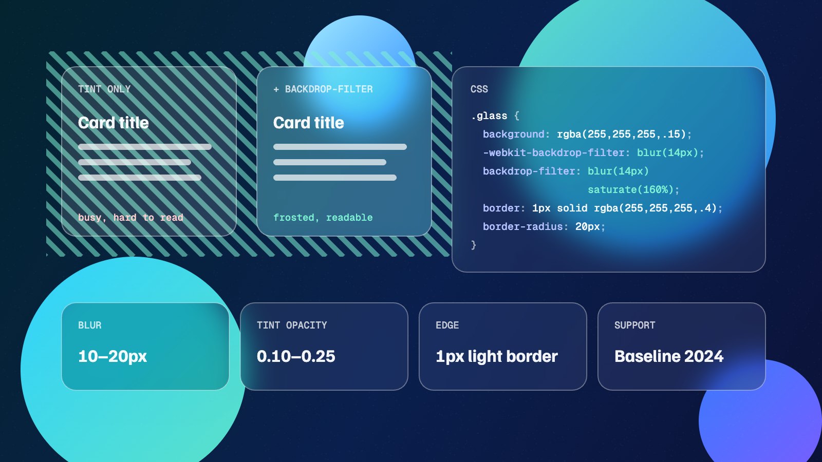
backdrop-filterblurs what sits behind an element, so the element needs a semi-transparent background to show it.- A blur of 10–20px with a tint opacity of 0.1–0.25 reads as frosted glass. Adding
saturate()stops colours going grey. - It works in all current browsers. Keep the
-webkit-line for Safari versions before 18. - Check text contrast against the lightest and darkest parts of the background, and give people who reduce transparency a solid fallback.
What glassmorphism needs to work
Glassmorphism is a UI style where panels look like frosted glass: you can see colour and shape through them, but softened. It became mainstream through macOS Big Sur and Windows 11, and it suits cards, navigation bars, modals and overlays that sit on top of imagery.
The catch is that glass only looks like glass when there is something interesting behind it. Over a flat colour, a blurred panel is indistinguishable from a transparent box. A photo, a colourful gradient or a few soft shapes give the blur something to work with. The CSS gradient generator and blob generator are quick ways to build that backdrop.
How backdrop-filter works
The ordinary filter property applies effects to the element itself and its contents. backdrop-filter applies them to everything painted behind the element, within the element’s own shape. The panel’s text and icons stay sharp while the page underneath goes soft.
Two things follow from that. First, the element’s own background must be at least partly transparent, otherwise it covers the blurred backdrop completely. Second, the effect follows border-radius, so rounded glass cards need no extra clipping.
It accepts the same functions as filter: blur(), saturate(), brightness(), contrast() and so on. In practice blur does the heavy lifting and saturation repairs the colour that blurring drains out.
Glassmorphism CSS, line by line
Here is a solid starting point for a glass card:
.glass {
  background: rgba(255, 255, 255, 0.15);
  -webkit-backdrop-filter: blur(14px) saturate(160%);
  backdrop-filter: blur(14px) saturate(160%);
  border: 1px solid rgba(255, 255, 255, 0.4);
  border-radius: 20px;
  box-shadow: 0 20px 50px rgba(8, 10, 30, 0.25);
}- background: a white tint between 0.1 and 0.25 opacity. Lower looks clearer, higher looks frostier and helps text contrast. On dark designs, try a dark tint such as
rgba(15, 20, 40, 0.35)instead. - backdrop-filter: 10–20px of blur reads as frosted glass. Below about 6px the background stays recognisable; above 30px it turns into a colour wash.
- saturate(160%): blurring averages colours together, which greys them out. A saturation boost keeps the glass looking lit from behind.
- border: a thin, semi-transparent white edge catches the light and separates the panel from the backdrop. Without it the card edge disappears on light areas.
- box-shadow: a soft, low-opacity shadow lifts the panel. The box shadow generator is handy for layering a couple of shadows for a more natural depth.
Browser support and the -webkit- prefix
backdrop-filter is supported in every current major browser. Chrome has supported it unprefixed since version 76 and Firefox since version 103. Safari supported only the -webkit-backdrop-filter form for years and added the unprefixed property in Safari 18 (2024), which is when the feature became Baseline.
Keeping both lines covers older iPhones and Macs that have not updated. If a browser cannot blur at all, you want a readable panel rather than a see-through one, so wrap the transparent version in a feature query:
.glass {
  background: rgba(30, 34, 60, 0.9); /* solid fallback */
}

@supports ((backdrop-filter: blur(1px)) or (-webkit-backdrop-filter: blur(1px))) {
  .glass {
    background: rgba(255, 255, 255, 0.15);
    -webkit-backdrop-filter: blur(14px) saturate(160%);
    backdrop-filter: blur(14px) saturate(160%);
  }
}
The nesting quirk
A common surprise is a glass element that stops blurring when it is placed inside another element. Under the current spec, an ancestor with a filter, an opacity below 1, a mask or its own backdrop-filter acts as a boundary, and the inner glass only blurs what is inside that ancestor. If your glass looks transparent but unblurred, check the parents for one of those properties.
Accessibility: contrast and reduced transparency
Text on glass is the biggest risk with this style. The colours behind the panel change as the page scrolls or the hero image changes, so contrast that passes in one spot can fail a few pixels away. Test text against the lightest and the darkest areas the panel can sit over, and raise the tint opacity behind body text until both pass.
Some people turn on “Reduce transparency” in their operating system because translucent layers are hard for them to read. The prefers-reduced-transparency media query lets you respect that. It is supported in Chrome and Edge but not yet everywhere, so treat it as an enhancement on top of good default contrast:
@media (prefers-reduced-transparency: reduce) {
  .glass {
    background: rgb(30, 34, 60);
    -webkit-backdrop-filter: none;
    backdrop-filter: none;
  }
}
Tip: Put text on a slightly more opaque inner layer than the card itself. The card keeps its glassy edges and the words sit on a calmer surface.
Performance on real devices
Blurring is handled by the graphics hardware and a few glass panels are fine on any modern device. Costs rise with the area being blurred, the blur radius and how often the browser has to redraw it.
- Use glass on a handful of elements, not on every card in a long grid.
- Avoid animating the blur radius. Fading the panel’s opacity or moving it with
transformis much cheaper. - Be careful with full-screen glass over video or constantly animating backgrounds, especially on low-end Android phones.
- A sticky glass header is a common pattern and usually fine, but test scrolling on a real mid-range phone rather than a desktop.
When to use glass, and when not to
| Good fit | Better avoided |
|---|---|
| Navigation bars over a hero image | Long-form reading areas |
| Modals and popovers over busy content | Dense data tables and forms |
| Feature cards on a colourful section | Pages with plain white or flat backgrounds |
| Media player controls over video | Dozens of repeated cards in a grid |
If the design is mostly flat, a soft shadow style may suit it better. The neumorphism generator and claymorphism generator cover two alternatives that work without a busy backdrop.
Build your own glass panel
The quickest way to find settings that suit your design is to try them over a real background. The glassmorphism generator lets you adjust blur, tint and highlight over three different backdrops, then copy the CSS with the -webkit- line already included. Start at 14px blur and 0.15 opacity, then tune from there.